Introduction
In late 2010 BenQ brought the best budget gaming monitor to the market in the form of the XL2410T. Deciding to take a different slant from the usual ‘3D capabilities’ that most 120Hz displays are built around, BenQ marketed this one as a ‘gaming monitor’ and had the endorsement of some rather good Counter-Strike players to boot. Looking beyond the smokescreen of marketing hype you were left with a product that seemed to have so much wasted potential. Although input lag was exceptionally low and BenQ had implemented an effective ‘Instant Mode’ to bypass much extraneous image processing the overall responsiveness was let down by noticeable inverse ghosting artifacts. The XL2410T also included some promising and unique image presets such as ‘FPS mode’, but these were poorly executed and threw gamma and colour balance way off course. In the early revisions of the screen, at least, there was little to repeal these issues even with careful fine-tuning via the OSD (On Screen Display) – so overall the monitor left a bitter taste in our mouths.

Fast forward a little over a year and BenQ are back with a new 120Hz gaming monitor – the XL2420T. This model has also been ‘co-developed’ (or at least marketed with the help of) ‘SpawN’ and ‘HeatoN’ of Counter-Strike fame. Their fellow professional gamers ‘Potti’, ‘ahl’ and ‘Fisker’ are also in on the act this time. Aside from some aesthetic modifications and some nice additional features (which we will be exploring later on in the review) BenQ are also keen to boast the out-of-the-box ‘Nvidia 3D Vision 2’ compatibility and intrinsic ‘LightBoost’ capability of the XL2420T. As the test system we use has an AMD graphics solution and Nvidia 3D Vision 2 isn’t integrated on the ‘T’ model (a key distinction of the ‘TX’ model available outside of Europe) we will be restricting our testing to two dimensions.
Specifications
The basic specifications of the XL2420T do little to distinguish it from its predecessor; but that isn’t necessarily a bad thing, depending on the execution. The screen is a full 24” this time, making it 0.4” (10.16mm) larger diagonally than the 23.6” XL2410T. It also features an LED-backlit 120Hz TN panel with 1920 x 1080 resolution with a quoted grey to grey response time of 2ms. The grey to grey acceleration (dubbed AMA or ‘Advanced Motion Acceleration’) can also be disabled, yielding a typical Tr+Tf (or ‘white to black’) response time of 5ms. Obviously these specifications tell us little about how this overdrive has been implemented and of course the overall image performance of the monitor – and that is what we endeavour to test in this review. In the specifications below the positive standout feature of this monitor has been highlighted in blue.
Features and Aesthetics
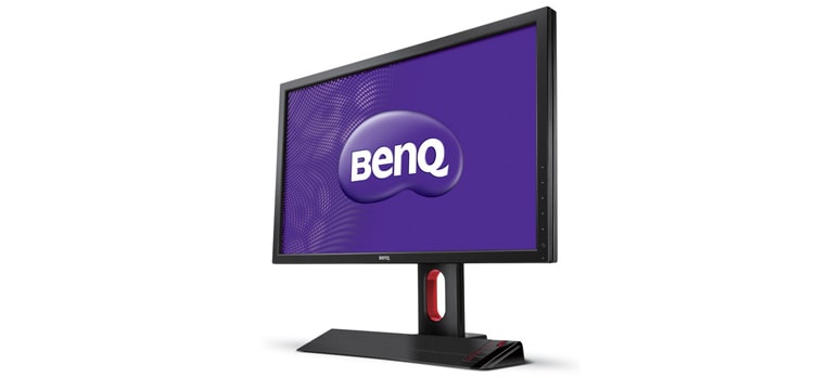
The BenQ XL2420T distinguishes itself from many modern entertainment monitors with its matte black bezel and angular appearance. The bezel is quite thin at around 17mm on all sides. The stand is fairly solidly built and sturdy, offering hdr 4k gaming monitor a good degree of adjustability.
The screen can be raised so that the bottom of the bezel clears the desk by 7.25 inches (184mm), as shown above. Raising the screen in this way also reveals a red oval-shaped ‘loop’ in the stand which is convenient for carrying the monitor about and reduces the weight of the stand. From a ‘normal’ seated position and with the stand set to a more ‘normal’ height this element is not as striking as it may appear in some pictures – so don’t worry if red isn’t your thing.

In the picture above the monitor has been lowered to its lowest height, the bottom edge around 1.9 inches (48mm) above the desk. You can therefore adjust the monitor’s height by around 5.35 inches (136mm), adjusting it to any position within this range. The adjustment itself is reasonably smooth despite the stand lacking any metal sliding elements – which tend to offer smoother operation with reduced friction compared to plastics. Other adjustability options include 20 degrees backwards tilt, 5 degrees forwards tilt, 35 degrees swivel either side and the ability to pivot the monitor into portrait mode by rotating it 90 degrees. These are again the extremes of adjustment and the monitor can be set to any position within the adjustment ranges. You can even adjust the monitor in such a way that using it becomes completely impractical, as below.

Another point to note is the screen surface, which appears typical of a BenQ TN panel monitor – a matte antiglare surface with a ‘haze value’ of around 25%. You can read more about the benefits and drawbacks of that here, but specific points of comparison are also made in the review.
The ‘S Switch’ is an intriguing feature which can be seen to the right of the monitor base in the pictures so far. This offers convenient navigation of the monitor OSD (On Screen Display) with a red scroll wheel, a return (or back) button and 3 numbered buttons which allow rapid switching between 3 saved customised monitor profiles. The switch attaches to either side of the monitor using a magnetic attachment mechanism or can be detached and used as a wired remote. The cable attaches to a Micro USB port centrally located behind the monitor, near the bottom. You can have the remote up to 27 inches (685mm) in front of the monitor should you desire. The image below shows the S Switch detached from the monitor.
The monitor’s OSD can also be controlled using 5 touch-sensitive buttons towards the bottom of the right bezel. The buttons are proximity and touch activated, as is the power button. If you move your finger towards this area when the monitor is switched off the power symbol glows an icy white, inviting you to touch it. It can be a little unresponsive compared to the other buttons but we found wiping downwards with the thumb worked well. When the monitor powers on the remaining buttons light up momentarily and then quickly turn off so you are left with a fairly unobtrusive gentle glow from the power symbol alone, as shown below. Note that the power button may appear slightly blue in the photograph but in reality appears nearly white as described previously.
If you move your finger close to this area again, now the monitor is on, the buttons will once again light up for a short period of time. They are inviting you to touch them and navigate through their glorious menu system. Responsiveness of these buttons is very good and much more consistent and reliable than most you would find on glossy monitor bezels. They are essentially similar in design to those found on the Dell U2410 and U2711 and sadly absent from the newer and cheaper UltraSharps.
Before delving into any detail about the operation of the OSD we will first return to the outside. From the side the monitor is dominated by its fairly robust stand. The screen itself, being LED backlit, is relatively slender – but BenQ certainly hasn’t gone overboard with a style over substance level of svelteness. According to our measurements the screen itself is 60mm thick. The total depth including all stand components is 235mm. At the left side of the monitor you will find 2 USB 2.0 downstream ports and a headphone jack.

You will also notice a red protrusion at the back of the top rated pc monitors. This is a ‘headphone hanger’ to allow the user to hang their headphones out of site in a convenient place when they are not needed. At the rear the monitor is again dominated by the stand. Interestingly this has a glossy black surround with the ports labelled in red. Also notice the red cable tidy near the bottom, which can help to organise the many cables you could have connected to the XL2420T. This can also be used as a ‘carrying loop’ along with the black plastic carrying handle at the top (above the red headphone hanger) and a Kensington Lock slot towards the bottom right.

The next picture you will see shows the monitor rotated into portrait mode to reveal its ports at the rear. From bottom to top (left to right in normal orientation); power input (AC with internal conversion to DC), Micro USB (for S-Switch), DisplayPort 1.2 (120Hz on PC), VGA, DVI-D Dual-Link (120Hz on PC), dual HDMI ports, USB 2.0 upstream and a third USB 2.0 downstream port. The essentials are certainly covered with a few extras thrown into the mix. We have been informed that the HDMI ports are not compatible with ‘HDMI 3D’ for games consoles and Blu-ray players and are limited to 60Hz on the PC as is usual for HDMI. The XL2420T is fully compatible with Nvidia 3D Vision and Nvidia 3D Vision 2 with Lightboost capability. Integrated functionality and the addition of ‘HDMI 3D’ for AV devices are the main differences between this and the ‘TX’ model available outside of Europe.
Another feature to note is that the stand is fully detachable using the black button found above (to the left of on the picture) the Micro USB port. Removing the stand leaves 100x100mm VESA holes for an alternative mounting solution.
The nifty ‘S Switch’ and touch sensitive controls which were covered previously control the new ‘Intuitive UI’ user interface (OSD menu system). This menu system includes various ‘layers’ as shown in the video below.
You can see that at first you are given a simple menu which includes ‘Picture Mode’ at the top. You can’t skip between presets on this menu and must cycle through each one individually in order, which is a bit cumbersome. Below this is ‘Display Mode’ which is a way to access the monitor’s ‘Smart Scaling’ feature. This allows the monitor to interpolate the image to fit a specific screen area and aspect ratio. The image loses sharpness as the pixels themselves can’t change size or rearrange themselves, but some people may find this feature useful. The camera focus was a bit off making the selectable screen sizes and aspect ratios a bit difficult to see, so they are shown in the image below as well.
he first three sections of the initial ‘simple menu’ can be customised by accessing the ‘system’ portion of the main (advanced) menu. You can also turn off the audible button feedback (called ‘buzzer’) here which is nice. The levels of the menu system now come into play with the first column showing setting categories and the second and third showing sub-categories or individual customisation options. One of the main features to note here is the ‘Black eQualizer’ (Black EQ) which is accessible on ‘FPS’ and ‘RTS’ picture modes and can be set between 1 and 20. The function of this is to enhance visibility in dark areas without affecting lighter shades or particularly dark ones such as black. The specific shade range targeted and how this affects the XL2420T’s tone response and image is explored in subsequent sections of the review.
Another notable feature is ‘Smart Focus’ which can also be found on some of BenQ’s other recent models (such as the EW2730V). This allows a particular area of interest on the screen to remain at full brightness whilst the surrounding area is dimmed. The position and size of the highlighted area can be customised but the default works well for non-full screen videos as shown before.
As the video shows you do have to configure this manually or disable it for videos of different sizes. Most people would probably prefer to make good use of the full screen area instead – that way the video is all you will see on the screen. Perhaps this is a useful feature for lower resolution videos but is misleading named as the ‘Smart’ implies some sort of autonomy.
Calibration
This calibration section is going to be a little different from usual as the BenQ XL2420T is a monitor brimming with and to some extent oriented around its various image presets. The image was assessed in the usual way, by using the Lagom LCD tests and familiar desktop backgrounds and icons as well as by running some game titles. The table below shows our observations and some basic readings taken using various image presets – note that the default preset mode on this monitor is ‘FPS 1’ with Black EQ set to 12. Unless explicitly mentioned all observations were made with everything set to the factory defaults for each mode.
| Picture Mode | Gamma (central average) | White point (kelvins) | Impressions |
| Standard (Gamma 1) | 2.1 | 6387K | Very bright. Some colours (particularly oranges) appear quite washed out. Some greens and reds appear oversaturated with apparent lack of shade range at the high end. |
| Standard (Gamma 2) | 2.2 | 6392K | Improves colour balance by way of reducing washed out look of some shades. Some oversaturation in places – again very bright at default brightness of ‘100’ and lacking richness. |
| Standard (Gamma 3) | 2.4 | 6388K | Slight oversaturation of blue and green but a rich (and again bright) look overall. Some bleaching at the top end, crushing subtle bright shade detail. |
| Standard (Gamma 4) | 2.5 | 6367K | Image is particularly rich under this setting. Shade crushing at the high end is reduced compared to ‘Gamma 3’ but colours generally deeper than they should be. |
| Standard (Gamma 5) | 2.6 | 6374K | Similar to ‘Gamma 4’ but a touch deeper. |
| Movie | 2.9 | 6703K | Too sharp (correctable) and too deep with significant crushing at the low end (not correctable). |
| Photo | 2.7 | 6710K | Image too deep and again overly sharp. The sharpness can be fixed easily using the OSD but the depth and oversaturation can’t. Blacks don’t appear crushed to the extent of ‘Movie’ mode. |
| sRGB | 2.4 | 6386K | Image appears slightly bleached – essentially quite similar to ‘Standard’ with default ‘Gamma 3’ enabled but less bright. |
| Eco | 2.6 | 6303K | Certainly not too bright – perhaps a touch dim. Image looks fairly dull and lifeless with some shade crushing at the high end. |
| FPS1 (Black EQ 0) | 2.5 | 6437K | A casual glance at the white point suggests well balanced colours without a particular dominance in any channel. A casual glance at the screen reveals significant oversaturation. This is particularly prominent on blues – which look quite stunning but very wrong. |
| FPS1 (Black EQ 12) | 2.2 | 6441K | Dark shades are lifted without much if any upset to brighter (mid to high end) tones or blacks. Image otherwise similar to Black EQ 0. |
| FPS1 (Black EQ 20) | 1.9 | 6443K | Dark shades lightened significantly with image elsewhere appearing much the same as with Black EQ disabled. |
| FPS2 (Black EQ 20) | 1.9 | 6441K | As FPS1 with Black EQ 20. |
| RTS (Black EQ 15) | 2.0 | 6439K | Blue looks lilac and some severe oversaturation elsewhere. Generally looks messy on the desktop but some fantasy-based real time strategy could possibly benefit. |
There is a lot to take in from the tables above. Really the take-home message is that the XL2420T has a great deal of preset and setting combinations to try out – but certain features are only accessible under certain modes. The image characteristics do change somewhat once you lower the brightness, which is the sane thing to do any most settings as it is often very bright. Generally we found the gaming modes to be the poorest in way of image quality, with intense oversaturation and some strange issues with ‘blue’ in particular having a copper sulphate look on the FPS modes and a strange lilac look on the RTS mode. Unfortunately the colour setup was so funky on these modes that even our Spyder3Elite colorimeter couldn’t make things look normal with an ICC profile. Also unfortunate is that BenQ decided to lock adjustment of the intriguing ‘Black eQualizer’ feature to these modes – a frustrating decision we feel. The table above shows that the average gamma recorded in the centre of the screen does change as you adjust the Black EQ setting. The graphs below show what is happening to the gamma response of the monitor when you have the monitor set to FPS1 (EQ0), FPS1 (EQ12) and FPS1 (EQ20), respectively.

The ‘Black eQualizer’ is designed to improve visbility in dark areas on games and allow you to spot your foes (and friends) more easily. The graphs above show the luminance (in cd/m2) recorded at various IRE percentages (grey levels, from black to white) with the EQ set to 0, 12 and 20. The default setting under ‘FPS1’ mode sets the EQ to ‘12’, which raises the luminance of shades between about 18% and 45% IRE with the most significant increases at the low end (dark shades). Anything close to black remains seemingly untouched as does any shade above a medium grey. Raising the EQ to ‘20’ increases the effective range to between approximately 5% and 55% IRE and raises the luminance to a greater degree – particularly below 30% IRE.
Interestingly if you look at the tone response graph for our test settings (which are revealed towards the end of this section) but with the brightness adjusted to correspond to FPS1’s peak luminance you can see that it follows a trace some way between ‘FPS1’ with the EQ set to ‘0’ and ‘12’. Note in particular the amount of ‘white space’ below the line at an IRE of under 20%. This may look very subtle but bear in mind the scale of the graph (20 cd/m2 major increments) and the fact that the black point is around 0.02-0.03 cd/m2. For some ‘dark greys’ the monitor is letting considerably more light through in ‘Standard Mode’ (see test settings) than with the Black EQ disabled on ‘FPS1’ despite the black point being lower on standard mode. In other words it’s as if ‘Standard Mode’ has the Black EQ enabled just a touch or is using similar ‘dark colour enhancement’ to that effect. We explore some of the practical implications of this in the ‘Contrast and Brightness’ section of the review.
Looking back at the presets now, generally the ‘Standard’ preset yielded the best image quality. The white point was always within a good range and different gamma modes were selectable alongside RGB sliders (default values 100 per channel). After lots of discussion amongst ourselves, fiddling with the brightness, gamma modes, colour channels and contrast (under various lighting conditions) we settled for the following to use as our test settings:
Picture Mode= Standard
Brightness= 36 (adjust according to preferences and lighting)
Contrast= 50
Gamma Mode= Gamma 4
Red= 96
Green= 97
Blue= 100
These settings gave a fairly rich and well-balanced image. Although some colours appeared deeper and some more saturated than they should this was preferable to the washed out (and bleached) or more heavily saturated alternatives. Very minor corrections were made to the colour channels to ease out a mild red and green bias – something that will undoubtedly vary somewhat between individual units. Despite a major reduction in brightness from the retina-singing defaults the image was still nice and bright. Increasing the brightness much beyond this made whites in particular a bit overbearing whilst reducing much below dulled colours unacceptably. This is all part of the tradeoff that presents itself on modes that more tightly fit a 2.4 average gamma than 2.2 – the modes that yielded the ‘desirable’ 2.2 average at centre gave slightly lacklustre colours. The contrast proved equally finely balanced with the default setting of ‘50’ proving optimal, so no change needed or recommended there.
Again it should be stressed that a desirable image for gaming or even general desktop use is a very subjective thing. The BenQ XL2420T offers plenty of flexibility with its image options so don’t be afraid to experiment.
Contrast and Brightness
We examined the peak white luminance, minimum black luminance and resulting contrast ratios under a great variety of settings. The readings in the table below were taken using a Konica Minolta CS-200 ‘Chroma Meter’ which offers a high degree of accuracy even at very low luminances. The highest white luminance, lowest black luminance and highest contrast ratio yielded under static contrast modes has been highlighted in black and the results obtained under our ‘test settings’ in blue for your reading convenience. Unless stated explicitly assume factory defaults for brightness, contrast and any other configurable settings for the purposes of this table.
| Monitor Profile | White luminance (cd/m2) | Black luminance (cd/m2) | Contrast ratio (x:1) |
| ‘Standard’, 100% brightness | 372 | 0.37 | 1005 |
| ‘Standard’, 80% brightness | 324 | 0.32 | 1013 |
| ‘Standard’, 60% brightness | 277 | 0.27 | 1026 |
| ‘Standard’, 40% brightness | 231 | 0.23 | 1004 |
| ‘Standard’, 20% brightness | 184 | 0.18 | 1022 |
| ‘Standard‘, 0% brightness | 139 | 0.13 | 1069 |
| Test settings, 36% brightness, 50% contrast (Gamma 4, custom RGB) | 209 | 0.21 | 995 |
| Standard Gamma 1 | 372 | 0.37 | 1005 |
| Standard Gamma 2 | 370 | 0.36 | 1028 |
| Standard Gamma 3 | 372 | 0.36 | 1033 |
| Standard Gamma 4 | 368 | 0.36 | 1022 |
| Standard Gamma 5 | 367 | 0.35 | 1049 |
| Movie | 221 | 0.35 | 631 |
| Photo | 217 | 0.34 | 638 |
| sRGB | 241 | 0.23 | 1048 |
| Eco | 172 | 0.17 | 1012 |
| FPS1 (Black EQ 0) |
229 | 0.36 | 636 |
| FPS1 (Black EQ 12) | 228 | 0.36 | 633 |
| FPS1 (Black EQ 20) | 227 | 0.36 | 631 |
| FPS2 (Black EQ 20) | 227 | 0.36 | 631 |
| RTS (Black EQ 15) |
226 | 0.36 | 628 |
The monitor put in a good performance with the picture mode set to ‘Standard’. An average contrast ratio of 1025:1 was recorded for this mode (excluding the test settings). The contrast ratio was consistently edging just above the 1000:1 specified by BenQ, which is a good result as often the specified value is misleading. Under our test settings the contrast ratio dropped just a touch to 995:1, so still strong after some minor colour channel adjustments.
The remaining presets were a bit of a mixed bag and with the exception of the ‘sRGB’ and ‘Eco’ modes contrast suffered significantly to values around 630:1. The white luminance for all of these presets was reduced whilst the black levels remained relatively unchanged – this may come as a surprise given the overall intensity of the image under many of these modes. Nobody would decide that these modes aren’t bright enough but the contrast needs to take into account the low end, too. And technically things were significantly brighter under the ‘Standard’ mode with a retina-BBQing peak luminance of 372 cd/m2 being recorded. This exceeded the 350 cd/m2 specified by BenQ and shouldn’t leave you begging for more brightness (and should help if you plan to use 3D shutter glasses, too). The minimum white luminance recorded under ‘Standard’ mode was 139 cd/m2 which is a little on the high side for some people. Although not recorded on the table a little further investigation revealed that the monitor could go down to 82 cd/m2 using the ‘Photo’ preset at a brightness of ‘0’. This gives the monitor a luminance adjustment range of 290 cd/m2 which is excellent.
We should also mentioned that a ‘Dynamic Contrast’ mode can be activated in ‘Photo’, ‘Movie’, ‘FPS1′, ‘FPS2′ and ‘RTS’ modes and set in ‘intensity’ from 0 to 5. Interestingly this means you can only activate it under the preset modes that offer relatively poor static contrast performance. Even set to 5 the monitor is slow to react to even extreme changes in brightness, taking 20 seconds to dim the backlight completely from an all-white to all-black screen for example. In some ways this is preferable to a wildly fluctuating and rapidly reacting dynamic contrast mode but it does mean the mode is not particularly ‘dynamic’ and won’t be able to keep up with more rapid scene changes. As we often say this mode is best avoided anyway as it is trying to adjust the whole backlight to compensate for the overall makeup of the scene – when in reality many scenes are a complex mixture of dark and light. If you do wish to make use of this mode at least know that you shouldn’t find the luminance changes too frantic.
Looking at the contrast across the screen now, and firstly at the uniformity of blacks across the screen. A quick visual inspection in a dark room, using our test settings, revealed no significant excess bleed-through (or ‘clouding’) was present. There was a slightly lighter area towards the bottom left corner but it manifested itself as a slightly lighter shade of grey with no hint of unsightly blue, white or yellow or any other colour. The uniformity of other colours is best highlighted by examining variation in white levels across the screen. Measurements were taken at 9 equally space quadrants running from the top left to bottom right of the screen, using a Spyder3Elite colorimeter. The table below shows the results of this test.
The luminance uniformity of the XL2420T was reasonable. The greatest deviations occurred at the top of the monitor (‘quadrant 1’) where the screen was 14% dimmer than centre (‘quadrant 5’) under our test settings. The lowest deviation was recorded at the top central region (‘quadrant 2’) here the screen was 9% dimmer than centre. Interestingly the centre was the brightest point of the screen at 203 cd/m2 – elsewhere the luminance was between 174.6 cd/m2 and 185.2 cd/m2. Due to the viewing angle limitations of the TN panel technology the screen appears relatively bright at the bottom and relatively dim at the top despite what the readings may tell you. This isn’t something that occurs to an extent that should worry most users. The white luminance uniformity of the BenQ is shown in the beautiful pattern (contour map) below. This combines recorded values with extrapolated data and a bit of artistic license.

Moving on now from the tedious figures to the all-important subjective testing. The first game title tested was Battlefield 3 with its Frostbite 2 engine. This game engine provides an impressive dynamic range with which to test the contrast of the XL2420T with some brilliant bright elements intertwined with deep and dark colours. The underground areas of the multiplayer maps ‘Damavand Peak’ and ‘Operation Metró’ flaunted this range particularly well. Artificial light sources, sparks and explosions didn’t quite have the ‘luminescent purity’ of their real-world counterparts (a restriction of the matte screen surface) but they were certainly bright and brilliant enough to stand out well against their dimmer surroundings. At the low end the monitor had no trouble at all displaying a good level of detail. In fact it often displayed too much detail due to the low end enhancements (partially enabled Black eQualizer, if you prefer) discussed previously. Using our test settings this meant small details on weapons, vehicles and building interiors were more readily visible in the dark than they should be. Fortunately this wasn’t aggressive enough to ‘flood’ the image and the darkest shades (black or close to) were still part of the mix.
The images below show the differences in low-end detail level on Battlefield 3 under ‘FPS1’ (EQ 0), ‘FPS1’ (EQ 12), ‘FPS1’ (EQ 20) and our test settings. Note that visually our test settings lie some way between ‘FPS1’ with the EQ disabled and the EQ set to 12, as you would expect given the tone response explored earlier.

The second game title we tested, Dirt 3, told a similar story at the high end. Lights from cards and the moon at night and the blazing sun of the day were suitably bright and contrasted well with the surroundings – despite being a little hazy. At the low end even the most subtle detail could be picked out. The car interior had subtle features emerge that you would rarely see – such as the fins of air conditioning vents and unusually well-defined edges. Outside the car things looked much as intended. Even at night the lighting on the game ensures things never look entirely dark. Whilst the grey tone was raised just a touch in places it looked much as intended, so you can’t really complain.
Things also looked as intended on our main film test title, which is the Blu-ray of The Girl Who Played with Fire. This was a relief as with plenty of dark and dingy scenes we were initially concerned that the low-end tone enhancements would affect the atmosphere. Everything looked in-place with an appropriate level of detail. The bright flashes from fires and lights in the film pierced the darkness and made for a very good ‘contrasty’ experience overall.
The contrast performance of the BenQ was also tested using the Lagom LCD tests, which are designed to expose any weaknesses in contrast performance which may or may not manifest itself during normal use. Internet Explorer 9 was used for these tests – the web browser can make a difference to how things are rendered here so it is important to keep the web browser the same or similar if you want to draw comparisons.
- The contrast gradients were very good. The darkest blue band blended into the black background and the upper two red shades appeared to merge together but otherwise distinct bands were visible.
- The monitor demonstrated ‘excellent visibility’ in the black level test. This was due in part to the low end tonal enhancements explored previously with the first two shades in particular appearing lighter than they should. The second block also has quite heavy static dithering. This was also evident on some of the other blocks but was generally much finer and better masked. As usual for a TN panel there was a noticeable gamma shift evident if you moved your head vertically in particular.
- Performance in the white saturation test was reasonably good. The second-last block was difficult to see and the last block invisible (not helped by the slight haze of the screen surface). Elsewhere the blocks were readily visible, but TN gamma shift was once again evident. You could reveal all of the blocks by raising the monitor height and lowering your head so you’re looking up at it – but this goes against the point of this test.
- The greyscale gradient appeared remarkably smooth. Some slight temporal dithering was evident at the darkest quarter but this was masked well.
In our testing we did notice some static dithering extend to the game titles we tested, largely as a result of certain shades being raised above their expected values. This was generally quite well masked and not immediately obvious unless you knew what to look for. We also noticed this became more extensive and times and if you look closely enough some thin horizontal bands would also crop up. These bands are very faint and thin and seem to be part of a temporary error in the dithering algorithm – they tend to take the place of temporal dithering, as if that part of the algorithm pauses and then malfunctions. The bands are barely visible even if you stop and stare at the screen so aren’t anything to worry about, but the good news is that you can get rid of them if you do stumble across them. If you disable ‘Instant Mode’ they will disappear and they will be kept at bay even if you re-enable ‘Instant Mode’. You can also simply switch to a different ‘Picture Mode’ and back again to reset the algorithm. Just be aware of this if you like to stick to one particular mode for everything as we did in our testing.
Colour Reproduction
The XL2420T’s colour gamut (red triangle) was compared to the sRGB colour space (green triangle) using our test settings and the Spyder3Elite colorimeter. This is shown in the image below:

As you would expect from a WLED-backlit monitor the colour gamut quite closely matches the sRGB reference. There is some deviation in greens with the monitor missing out some of the sRGB shade coverage but extending beyond this for other shades in this region. Since this only gives an indication (and a fairly rough one at that) of the shades that could potentially be displayed it is best not to look too much into this. Instead, indulge yourself in the ‘real world’ performance tested below.
In our first game test title, Battlefield 3, the XL2420T showed off a pretty impressive colour range with some fairly vibrant and intense shades intermingling with some more muted tones. The greens were handled particularly well on this title – looking appropriately rich (impressively so in places) and correctly saturated. The natural browns and greys of dirt and rocks were also displayed as intended without any unwanted colour cast. Although some colours lacked the intense and pure vibrancy that a glossy screen surface can offer they were certainly firmly on the vivid side and did not look washed out. The rich oranges and reds from roaring flames and the electric blues from the engineer’s repair tool were certainly eye-catching.
Our second test title, Dirt 3, is from a different genre. In many ways this is a better test for colour reproduction than Battlefield 3 as it is less restricted in its colour palette. The BenQ made good use of this, showcasing a good variety of colours. From the deep and rich forest greens of Finland to the golden greens and earthy browns of Kenya the environments all looked natural and true to their locations. The spectrum of greens between were also handled impressively – the Michigan rally tracks showing this off particularly well. The car paintjobs also showed strong shade variety and good intensity. Deep blues and reds stood out particularly well here. Certain shades such as deep orange, yellow and cyan didn’t quite have the same vibrancy we have seen from monitors with glossy or low-haze screen surfaces but they were certainly vivid and far from being washed out.
We also tested the colour reproduction of the monitor on two Blu-ray film titles, the first of which was ‘The Girl Who Played with Fire’. The good natural colour reproduction capabilities of the BenQ XL2420T once again shone through in this title. Skin tones appeared appropriately saturated whilst showing a respectable variety of pinks and ‘peach’ shades. Vegetation and natural environments also showed pleasing variety and looked in-place, whilst some more intense shades were showcased by elements such as red streetlights and blazing fires. The second movie tested was Futurama: Into the Wild Green Yonder. Set in a fictional and rather colourful animated universe this often provides a particularly good benchmark against which to test a monitor’s image performance. The BenQ showed a pleasing variety of pastel shades on this film, including various minty greens, pale blues and muted yellows and oranges. However; due to the limitations of the TN panel technology some particularly subtle ‘identities’ such as character skin tones were lost. The position of the character on the screen, for example, would alter the shade displayed. These slight variations could also be seen on large areas of individual colour displayed on the screen, making them appear as a slight gradient. This is explored in more detail in the ‘Lagom’ viewing angle analysis subsequent to this section. The vibrant shades on this film were again held back slightly by the screen surface but were still impressive. Of particular note were vivid yellows, electric pinks and various other ‘neon’ shades which were displayed with respectable intensity.
Viewing Angles
At various points in the review so far we have explored how viewing angles can affect the consistency of colours and contrast across the screen. Because this affects the consistency of colours we can’t recommend the XL2420T for colour critical work – as we wouldn’t any other monitor with a TN panel. If you also consider moving yourself so you are viewing the monitor from a decentralised position then these issues become even more pronounced. The extent of colour variation across the screen can be looked at in more detail using the Lagom viewing angle tests:
- The purple block appeared purple towards the top transitioning to pink further down – particularly at the bottom third, extending further up at the left side of the screen.
- The red block appeared a fairly rich red right at the top but quickly turned to a pink-red further down.
- The green block appeared impressively pure-looking at the top with a slight yellow tint mixing in at the bottom half.
- As usual the blue block appeared a very even and quite deep blue.
- The Lagom ‘text test’ confirmed that the XL2420T’s gamma curve is influenced greatly by viewing angle. It appeared green at the top transitioning and red at the bottom with a transition to orange between. If viewing angle was not influencing the gamma curve of the monitor it would appear a blended grey.
The following video shows the results of the ‘text test’ from both centralised and decentralised positions. To help demonstrate some of the colour, gamma and contrast shifts that can occur ‘off angle’ we have included a video showing movement around a mixed desktop image. It is difficult to gauge more subtle changes on a video but you should be able to see a particular weakness in vertical compared to horizontal viewing angles – with significant contrast shifts and colour inversion after a certain point.
Conclusion
Our regular readers will probably notice that this review is considerably longer than our other recent reviews – which are in themselves very detailed as far as monitor reviews go. Really the extra pictures, tables, videos and accompanying words are testament to how much there was to say about the BenQ XL2420T. The monitor gives the user a good degree of ergonomic flexibility, allowing full adjustments to be made to suit viewing preferences. This was certainly a benefit of its predecessor and, along with the ‘sensible’ matte bezel was something that always distinguished BenQ’s 120Hz monitors from the competition. This monitor certainly isn’t short of connectivity options, either, offering a 3 distinct digital display inputs and the old VGA port and USB for good measure.
The new Intuitive UI menu system was also very easy to navigate, either using the highly responsive proximity and touch sensitive buttons (a touch usually reserved for high-end Dell IPS monitors) or the ingenious ‘S-Switch’ remote with scroll wheel. And given the extensive array of menu options and presets, which really forms a cornerstone of this monitor, intuitive navigation of this is appreciated all the more. And that same cornerstone of presets and features led to a little bit of initial disappointment. Certain features, such as the Black eQualizer, were locked to certain presets such as the FPS and RTS modes. These same presets were marred with uncorrectable oversaturation and contrast issues. Only the ‘Standard’ image preset, which lacked adjustment of the Black eQualizer, had full RGB and gamma mode adjustment.
This initial disappointment was largely alleviated once we settled on some settings we liked. Contrast performance was excellent, according to both the colorimeter and subjective assessment whilst colours appeared satisfyingly rich and varied. Furthermore the often dreaded excess backlight bleed-through was not an issue with our unit at all – and all of this is the polar opposite of what we experienced with this monitor’s predecessor. We would have liked to see BenQ implement the same highly effective and surprisingly smooth low haze screen surface to help get even more from the monitor, as they have done with their VA panels – but this doesn’t really detract from all the positives experienced here.
Responsiveness of the monitor was also excellent. Despite some slight hints of overdrive artifacts none of the team found this a problem during our subjective testing – this seems to be yet another area where BenQ have improved performance compared to this monitor’s predecessor. Input lag was also exceptionally low and given the overall pixel performance and 120Hz refresh rate gave a satisfyingly smooth and fluid experience that is sure to remind many gamers of their oldschool CRT days.
Everything considered, including what is a very decent price for a 24” 120Hz LCD monitor and the vast improvements made over its predecessor; it seems that this time, BenQ got most things right.
| Positives | Negatives |
| An excellent array of presets, innovative new features such as the Black eQualizer and very simple navigation through the Intuitive UI menu system. | Certain features are limited to certain presets. The Black eQualizer can’t be adjusted outside of ‘FPS’ and ‘RTS’ modes – although ‘Standard’ mode seems to have it enabled at a low level anyway |
| Good ergonomic flexibility and a pleasing range of inputs |
Red elements and lack of ‘glossy look’ may put some people off |
| Moderately high-haze matte antiglare screen surface minimises glare in most lighting conditions and eliminates reflections | The clarity and vibrancy of the image is held back by this – a compromise such as the low-haze surface used on BenQ’s VA panels would be preferable |
| Very strong contrast performance using test settings with good blacks, very little backlight bleed-through (may vary) and bright whites |
Contrast performance is poor under ‘FPS’, ‘RTS’, ‘Movie’ and ‘Photo’ presets with some ‘crushing’ issues present on other modes too |
| A good rich look to colours with good balance and an impressive shade variety for a TN panel under our test settings |
Colour performance is poor in various presets with issues ranging from noticeable oversaturation to a washed out look and some crushing of shades. TN panel limits colour consistency |
| Exceptionally responsive and fluid with next to no input lag and low levels of visible trailing | Some overdrive-related artifacts are present – shouldn’t be a problem for most users, reduced compared to XL2410T but there nonetheless |
PC Monitors Score – 84%
[yasr_overall_rating]